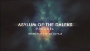
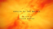
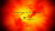
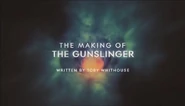
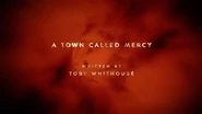
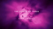
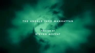
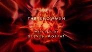
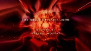
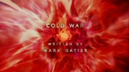
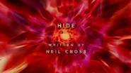
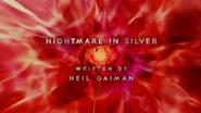
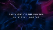
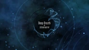
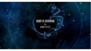
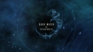
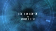
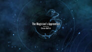
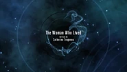
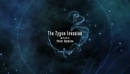
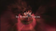
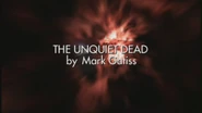
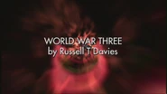
Title cards for Doctor Who have either the episode title, writer's name or episode number superimposed over the opening title sequence or initial sequences of the episode.
The following sub-sections have galleries illustrating the changes in font and format that the Doctor Who title card has gone through from the earliest title cards where each episode had an individual title to the 1980s-2011 where each title card became more uniform as post-production methods became far more controlled.
First Doctor
For Seasons 1, 2 and most of 3 each episode had its own title, so each episode title card is shown. For most William Hartnell episodes the title card was superimposed over the action instead of the opening titles.
Font: Grotesque from Stephenson Blake (or variant).[note 1]
Animation: Fade in, Fade out.
Beginning with TV: The Savages each story had an overall title followed by an episode number.
For TV: The War Machines a special computer-style font was used, with each letter appearing one at a time, while flashing in and out of negative.
While TV: The Tenth Planet had the title card appear and disappear amongst numerous letters.
Font: Grotesque One Three (TV: The Savages, The Smugglers)/Eurostile (TV: The Tenth Planet onwards)
Animation: Fade in, Fade out.
Second Doctor
While having the title card superimposed over the action was still the norm, starting from TV: The Macra Terror it started being superimposed over the opening titles for some episodes.
During the Patrick Troughton era several stories had special film sequences made for the title cards to be superimposed on to.
In TV: The Ice Warriors where the title cards would appear burley, zoom out, become clear then disappear, over shots of glaciers and ice.
In TV: The Wheel in Space they were superimposed over a mixture of the opening titles and shots of The Wheel.
In TV: The Seeds of Death they were superimposed over shots of the Earth & Moon in space.
And in TV: The War Games the were superimposed between shots of explosions & gunfire, flashing in and out.
Font: Eurostile (except TV: The Ice Warriors, The War Games)
Animation: Fade in, Fade out.
Third Doctor
Starting with TV: Spearhead from Space the title card is superimposed over the opening titles, with TV: Inferno the only exception where the title card was superimposed over shots of a volcano erupting, with it appearing burly, zooming out, become clear then disappearing.
Font: Futura Bold (until TV: The Green Death)/Futura Extra Bold (TV: The Time Warrior onwards)
Animation: Fade in, Disappear. (Exception: TV: The Ambassadors of Death which used a unique format: hard cut to the words "The Ambassadors", zoom towards camera, then "of Death" appearing with a "sting" sound effect.)
Fourth Doctor
Font: Futura Extra Bold (until TV: The Seeds of Doom)/Della Robbia Bold (TV: The Masque of Mandragora - TV: The Horns of Nimon)/Helvetica Rounded Bold with Upper Case "G" & Lower Case "t", from VAG (TV: The Leisure Hive onwards)
Animation: Appear, Disappear (TV: Robot – TV: The Horns of Nimon)/Fade in, Fade Out ((TV: The Leisure Hive onwards)
Fifth Doctor
Font: Helvetica Rounded Bold with Upper Case "G" & Lower Case "t", from VAG
Animation: Fade in, Fade Out.
Sixth Doctor
Font: Helvetica Rounded Bold with Upper Case "G" & Lower Case "t", from VAG
Animation: Fade in, Fade Out.
Seventh Doctor
For the first time in the show's history the episode title and writer's credit appear on the same title card, this has now become the norm.
Font: Univers Light Ultra Condensed (story/writers credit) & Eurostile Extended Bold ("by" credit).
Animation: Fade in, Fade Out.
Ninth Doctor
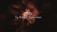
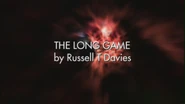
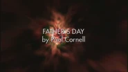
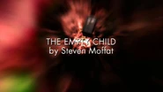
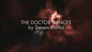
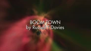
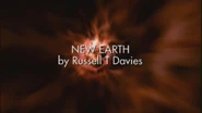
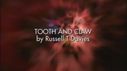
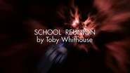
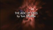
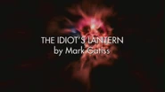
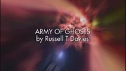
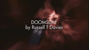
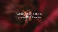
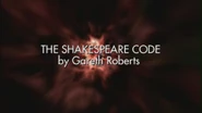
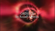
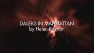
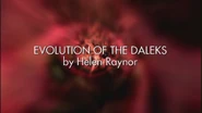
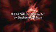
Font: Futura Book Animation: Fades in/Fades out
Tenth Doctor
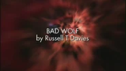
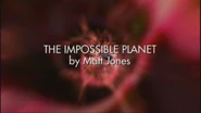
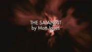
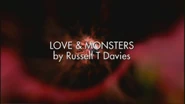
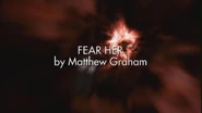
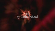
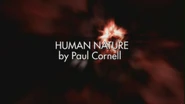
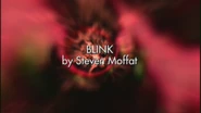
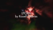
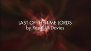
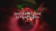
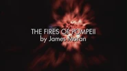
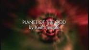
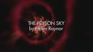
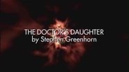
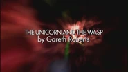
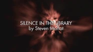
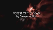
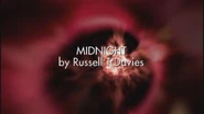
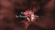
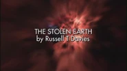
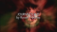
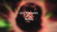
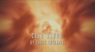
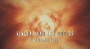
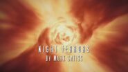
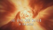
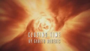
Title Card fades in and out from 2005-2009. During 2009 the title fades in, slightly zooms in and fades out. Font: Futura Book
Doctor Who website title card
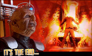
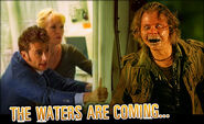
For the fourth series of Doctor Who, the BBC published title cards for each episode, on the official Doctor Who website.
Miscellaneous
Eleventh Doctor
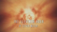
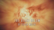
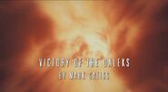
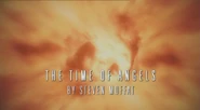
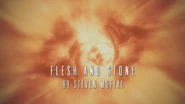
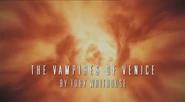
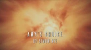
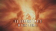
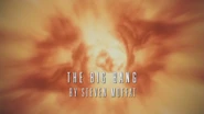
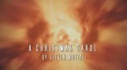
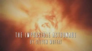
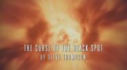
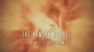
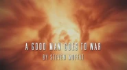
From The Eleventh Hour to The Doctor, the Widow and the Wardrobe, the title caption appears at the bottom for the first time since Season 24. The font is SF Movie Poster and the text blurs in, grows slightly, blurs out.
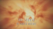
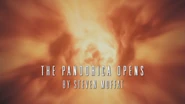
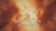
From Asylum of the Daleks onwards, the title and writer centred again with greater spacing, and with a filamentous animation. The font used is Contax Bold Small Caps, and has a mottled effect.
TV: The Night of the Doctor is an Eighth Doctor story, borrowing the series 7b title card format used by the Eleventh Doctor in a darker vortex effect.
Twelfth Doctor
Notes
- ↑ The foundry Stephenson Blake closed in the 1990s. Their designs included a grotesque from the 19th century similar to the one used in the first Doctor title cards and credits. Today equivalents include:
- Bureau Grot (formerly Grotesque) by Font Bureau (1989)
- Weight Comp Book (formerly One Three).
- Grotesque No 9 by URW++ (2000)
- Available weight is bolder.
- Grotesque 6 by Émilie Rigaud (2010)
- Available variants are not compressed.
- Brezel by MilieuGrotesque (2011)
- Available variants are not compressed.
- Bureau Grot (formerly Grotesque) by Font Bureau (1989)


![Tcromans3.JPG (41 KB) ]]"](https://static.wikia.nocookie.net/tardis/images/4/43/Tcromans3.JPG/revision/latest/scale-to-width-down/120?cb=20100403110644)























![Pond Life titles.jpg (27 KB) ]]](https://static.wikia.nocookie.net/tardis/images/5/5c/Pond_Life_titles.jpg/revision/latest/scale-to-width-down/185?cb=20190314163201)
